What Is Rich Black? When to Use It and When to Avoid It
Rich black is black built from black ink plus a share of cyan, magenta and yellow, instead of black ink alone. Printed as a large area, black ink on its own (100% K) can look slightly greyish or flat; the colour underneath deepens it into a dense, true black.
A commonly recommended build is C60 M40 Y40 K100. It is a widely used industry starting point, not a CDM specification; printers differ in their exact recipe.
Where rich black helps
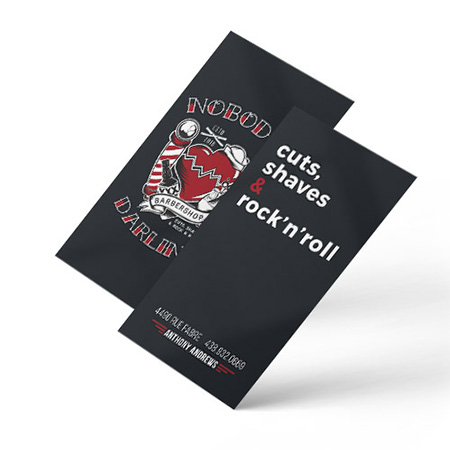
Use rich black for large black areas: full black backgrounds, big black shapes, bold headlines and black borders on posters, cards and covers. Next to plain 100% K, the difference is visible: rich black reads deeper and more even.
Where to avoid it
Keep small text, thin lines and barcodes in 100% K. Every extra ink adds a layer that must line up exactly; on fine detail, a hairline of misregistration shows as a coloured fringe around letters. Our CMYK vs RGB guide gives the same advice for black-and-white work. Also avoid the "registration" black some software offers, 100% of all four inks: it is far more ink than the paper needs and can smudge or look muddy.
Setting it up in your file
Define rich black as its own CMYK swatch and apply it to backgrounds and large type only. Check that black text from templates and pasted content is plain 100% K, and that an RGB black has not been converted into an unpredictable four-colour mix. If a black area runs to the edge, give it bleed like any background.
Which one for your job?
Rule of thumb: big black, rich black; small black, 100% K. If brand colours are also at stake, see our Pantone entry on how colours shift between systems.
Common questions
What CMYK values make rich black?
A common recommendation is C60 M40 Y40 K100. Some designers prefer a cooler black with extra cyan or a warmer one with extra magenta and yellow; the principle is the same, a full K plus support colour underneath.
Should text be rich black?
Not small text. Body text, fine lines and barcodes should be 100% K so no colour fringe appears if the inks are a hair out of line. Large display type can use rich black.
Why does my black look grey when printed?
Large areas of 100% K alone can look slightly grey compared with the deep black you see on screen. A rich-black build for those areas fixes it.
Products where this term matters
See also in the dictionary: Pantone (PMS), Bleed, Vector vs raster · full dictionary
Not sure what your file or paper needs? Choosing is part of the job, we advise at 514.844.0388.
Browse products and order